The Journey
Scoop Up was the first business I founded and designed entirely from scratch. I got the idea from an online forum about low start up cost businesses. It seemed simple enough that it would be a great starting point in learning how to build a business completely from scratch. When I started planning, I thought the most important aspect would be having an online presence. My first instinct was to code the website from scratch, but with no background in it, I would have burned a lot more time than I had. After researching web building options, I landed on Webflow and spent a significant amount of time getting used to the user interface through tutorials, trial and error, and trying to finish the home page. This was also my first time designing anything for a real product.
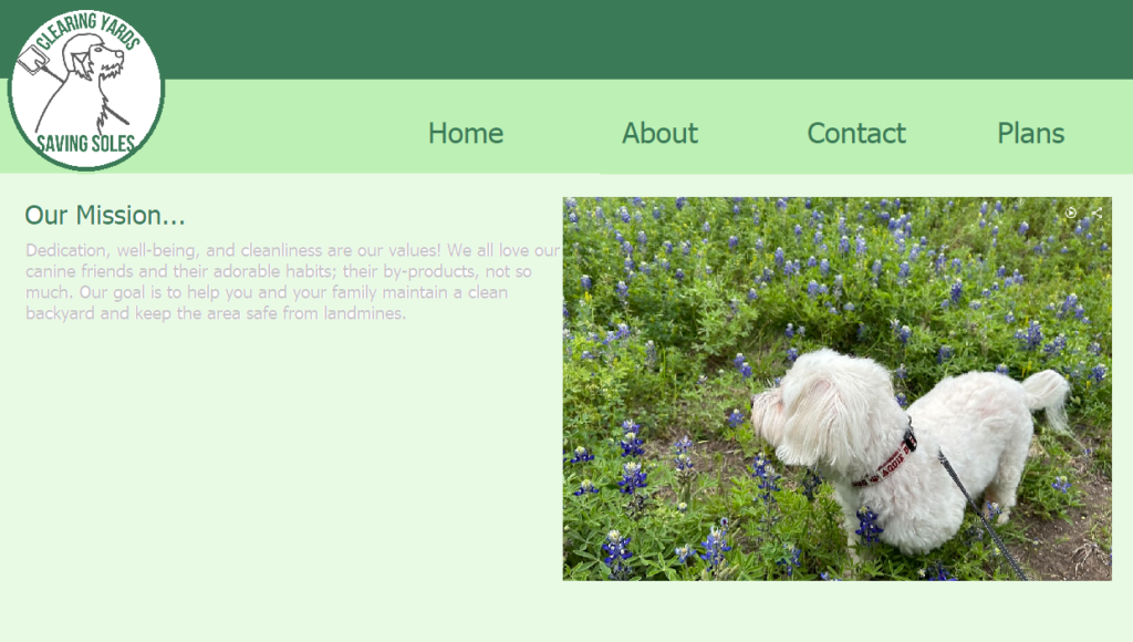
This is what I made in MS paint to outline the home page and get an idea of what I wanted it to look like.
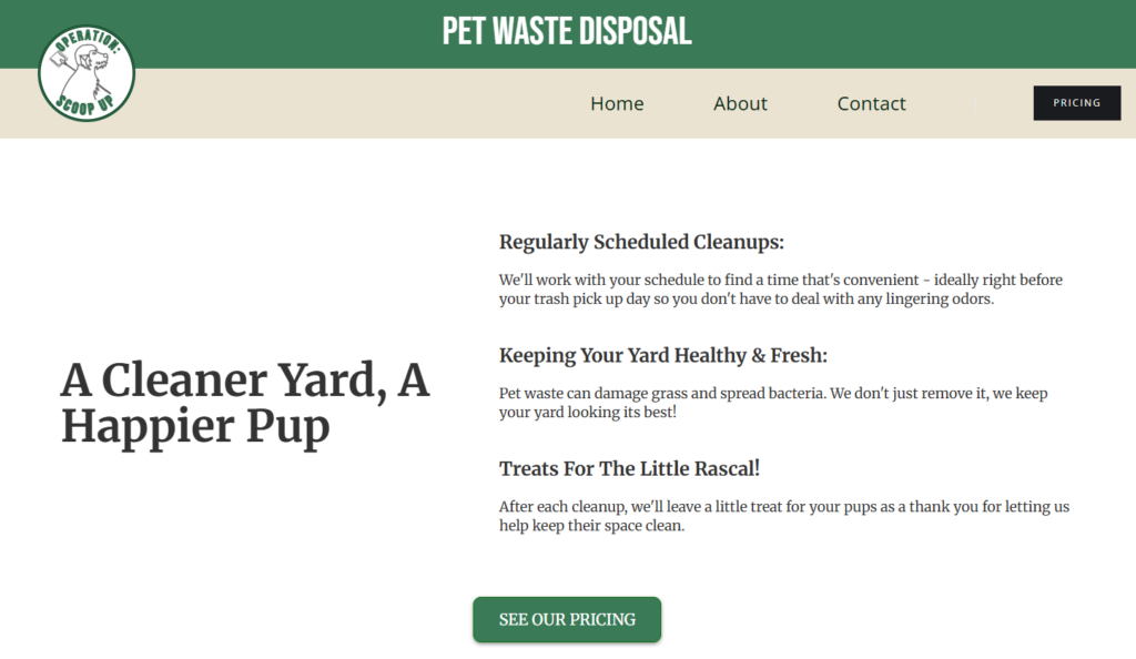
This is the landing page I made in Webflow after getting more familiar with the software and learning basic design practice.
Eventually, after studying other websites I was able to make better design choices as well as implement call to action buttons that were more immediate. In addition to this, I wanted the website to have more detailed descriptors first. Progress was slower than it should have been. I spent a lot of time waiting for the right moment and studying social media trends without acting on them. I since learned that the real obstacle was this belief that I needed to understand how websites worked before I could improve mine. That pressure was entirely self- imposed, but it felt very pertinent at the time.
When I finally pushed past that belief, everything clicked. I learned about routing, HTML, domains, and hosting as a founder who needed to make informed decisions. This understanding resulted in a much needed facelift. I changed a lot of things for the brand including: switching over to WordPress for website design, revamping the logo, setting up a more clear and functional pricing page, setting up Stripe compatibility, Google Workspace for business, and creating more pages that painted a fuller picture of what the service entailed. Below is an interactive window for you to scroll through, or you can click here and peruse yourself!
Logo Design and Branding
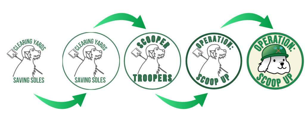
This graphic documents the evolution of Scoop Up’s logo. The first was built off a preset in Canva with modifications meant to resemble my dog, paired with the slogan “Clearing Yards, Saving Soles”. The second iteration placed the logo inside a circle using the company colors, which gave the logo a recognizable shape to be placed inside such as a coin.
The third iteration replaced the slogan text with a name I had settled on at the time: Scooper Troopers. I was excited about it at first, but research into competitors and a quick search on the USPTO trademarks database showed that somebody registered the name. Not only that, but countless other businesses across the US used the same name, and coming from a legal background, I recognized the potential risk early enough to act on it. The name itself is something that would stick with a client base due to the rhyme scheme, but unfortunately the tradeoff is potential confusion.
So, I took a more modern approach by renaming the company Operation: Scoop Up, or Scoop Up for short. I did this specifically to avoid any potential legal complications. Catching this early is one of the better decisions I made for the company. This iteration featured an even thicker, triple layered circle to give more of an embroidered patch feel, which signifies care and that the company is qualified to operate in a client’s backyard.
The fifth and final iteration reflects a deliberate creative decision while retaining features from the original logos. This included full incorporation of the company color palette, the transfer of the shovel to be a symbol on the helmet with a rake to reduce ambiguity, and a cartoon rendition that more closely resembles my dog; the original inspiration behind the logo. This logo is the final version I would have designed if I had known about Affinity and had my current skill set with it.
Taking it to Market
When I first began actively promoting the business, my strategy was based on what I already knew and received from other landscaping and service businesses. With a background canvassing for a solar company, I placed an order for door hangers after completing the design and got ready to place them on doors.
I will briefly explain my design choices for the door hangers. I found a stock photo of the Pennybacker bridge heading toward the city of Austin. This symbolizes and establishes that the company is on it’s way to serve Austin neighborhoods and that we are also the key to approaching the city faster. Any local that has lived in the city or surrounding areas would immediately recognize the iconic bridge and understand the level of class the brand provides. Below that I decided to place the logo as large as what appeared aesthetically pleasing. I coupled that with another tagline: “Life’s too short to scoop your own yard.” in Caveat, a font with a handwritten feel meant to signify craftsmanship and care. And below that, I placed three icons meant to highlight the biggest differentiators between our brand and competitors. Those being a paw, a message bubble, and camera.
I placed the paw to show that we leave a treat after each visit because the paw is a universally friendly symbol and the treat is a gesture of friendship. The text bubble is fairly self explanatory. I noticed that a common complaint and something that other businesses got praised for was quality of correspondence with their clients. This also includes notification of service 30 minutes before arrival. The camera is also self-explanatory. Part of the correspondence for the service is providing a locked gate photo to signal that service has been completed and that their property is secure.
On the back of the door hanger, I have another paw for small bags of treats to be stapled to with the caption “The worst first impression is pissing off the guard dog, so we left this instead”. ‘This’ refers to the treat and the door hanger itself. This proved to be great phrasing because it meant I could run tests on whether stapling the treat to the hanger converted more. While I did not get any solid data or evidence, the versatility of the phrasing is useful. To follow this, I put a quick description of the service along with contact info, a web link, and a QR code for easy access to the website.
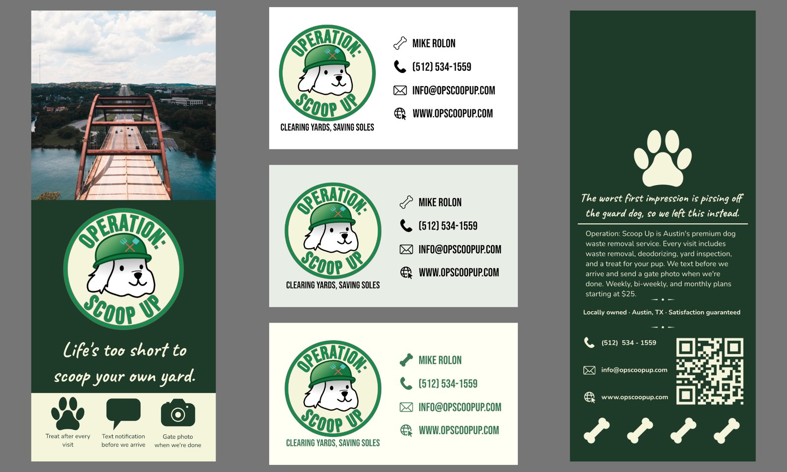
This is a collage of all the business assets and advertising I designed for the company. I designed three different cards, but I went with classic white for a more professional look.
Challenges and Lessons Learned
On my first day canvassing, I ran into other residential service businesses and started building rapport, exchanging business cards, and informal referral agreements. I set my routes to be as close to a closed loop as possible from a single parking spot in order to minimize driving. I ordered 500 hangers and shot for putting up 50-100 per day. There were times where I encountered residents outside their property and I used my judgement to determine whether talking to them was worthwhile. The first question I asked in these instances was if they had a dog. If they did, I pitched the service; if they didn’t, I requested they tell their friends.
Eventually, I realized how slow and how few people I was able to reach. In addition to the website, the online presence was bolstered by the creation of a Facebook page and Nextdoor account. I made two posts about the service in neighborhood groups. I got two clients with the ads I made; both signing up for a one-time pick up. Those were the only clients I ever signed. The total return was two clients from 350 door hangers and two social posts.
It is worth noting that I actively sought out opportunities beyond direct canvassing. I monitored my local chamber of commerce website for community pet events and attended “Painting with Puppies”; an event hosted by a local art garage. I bought a ticket to attend, brought treats to stay true to the brand, painted a clay dog, and left business cards and dog treats; requesting that they be given out to families that adopted a dog. I visited local pet stores as well and left a few business cards with the same intended purpose.
The core problem I faced was inconsistency and underspending on distribution. I canvassed sporadically rather than systematically and also pulled back on paid advertising before I had enough data to draw a meaningful conclusion. This is what I would have done differently:
– Spent one day a week planning and scheduling content and ads to release that corresponding week rather than posting reactively.
– Ran paid ads longer and with a tighter target demographic.
– Supplemented door hangers with printed flyers in high foot-traffic areas.
– Scaled the door hanger volume well beyond 500.
The ROI for the doorhangers is only beneficial in volume, and 500 units is not enough to draw a conclusion about whether this method is beneficial. I also would have invested in more local targeted ads on Facebook and other online platforms that would have been more profitable for this business.
The business model is solid. The marketing execution needed more consistency, budget, and patience than I gave it.
What I learned is that I am naturally drawn to brand building and design. I really appreciate the skill I built just from this singular business model and the feeling of building something real. I also really loved the execution of building a brand from the ground up. That foundation is something I intend to keep building on.
Skills and Tools Used

Affinity Designer

WordPress

Nextdoor

Canva

Stripe

Facebook Ads

Google Workspace

Stride

Google Maps

Webflow

Pexels

Davinci Resolve